
I’ve been searching around for an interesting data science project, and I ended up landing on the U.S. CBP Wait Time data. Most exciting the ever, right? I know.
There are actually a lot of cool things we can look at here! For one, this is a perfect opportunity to take a bottom-up approach, as I have absolutely no domain knowledge of how and why the Department of Homeland Security does what they do. How much can we infer from just looking at these data? It’s a great exercise in asking questions and figuring out how far a limited dataset can take us. For two, I travel a lot. Like. A whole lot and one of the interesting things about border control is that they are dealing with surges all day, every day. 250+ people come in on one flight, bunch up, get cleared, and then it’s empty until the next fight arrives. I think that is a pretty difficult problem to solve and I’m excited to do some exploratory analysis to see just how efficiently they solve it!
The data goes from 7-1-2009 to 1-18-2016. Where appropriate, I use 1-1-2010 to 1-1-2017, so that we have a coherent/complete dataset. Here are the columns in our dataset with a brief description:
Date: Arrival Date(s) and Hour(s) of flights associated with the airport/terminal/date range selected.Wait Times: Opening hours 6:00 am – 1:00 am (next day)
- Average:The average wait time for all passengers on flights arriving in the one hour increment.
- Max:The highest wait time for any passenger on a flight arriving in the one hour increment.
Number of Passengers Time Interval:
- 0-15:The actual number of passengers on flights which arrived in the selected hour who were processed in (0-15) minutes.
- 16-30:The actual number of passengers on flights which arrived in the selected hour who were processed in (16-30) minutes.
- 31-45:The actual number of passengers on flights which arrived in the selected hour who were processed in (31-45) minutes.
- 46-60:The actual number of passengers on flights which arrived in the selected hour who were processed in (46-60) minutes.
- 61-90:The actual number of passengers on flights which arrived in the selected hour who were processed in (61-90) minutes.
- 91-120:The actual number of passengers on flights which arrived in the selected hour who were processed in (91-120) minutes.
- 121Plus:The actual number of passengers on flights which arrived in the selected hour who were processed in (121 Plus) minutes.
Excluded:The actual number of passengers on flights which arrived in the selected hour who were excluded from wait time reporting.Total:Total number of passengers aboard arriving flights during the one hour increment.Flights:Number of flights arriving during the time period.Booths:Number of staffed primary inspection booths open to process flights which arrived during the selected hour.Per Flight:Average number of people per flight for that hour. Flights / TotalMins Waited:Average total minutes waited for that hour. Average * Total
Exploratory Analysis
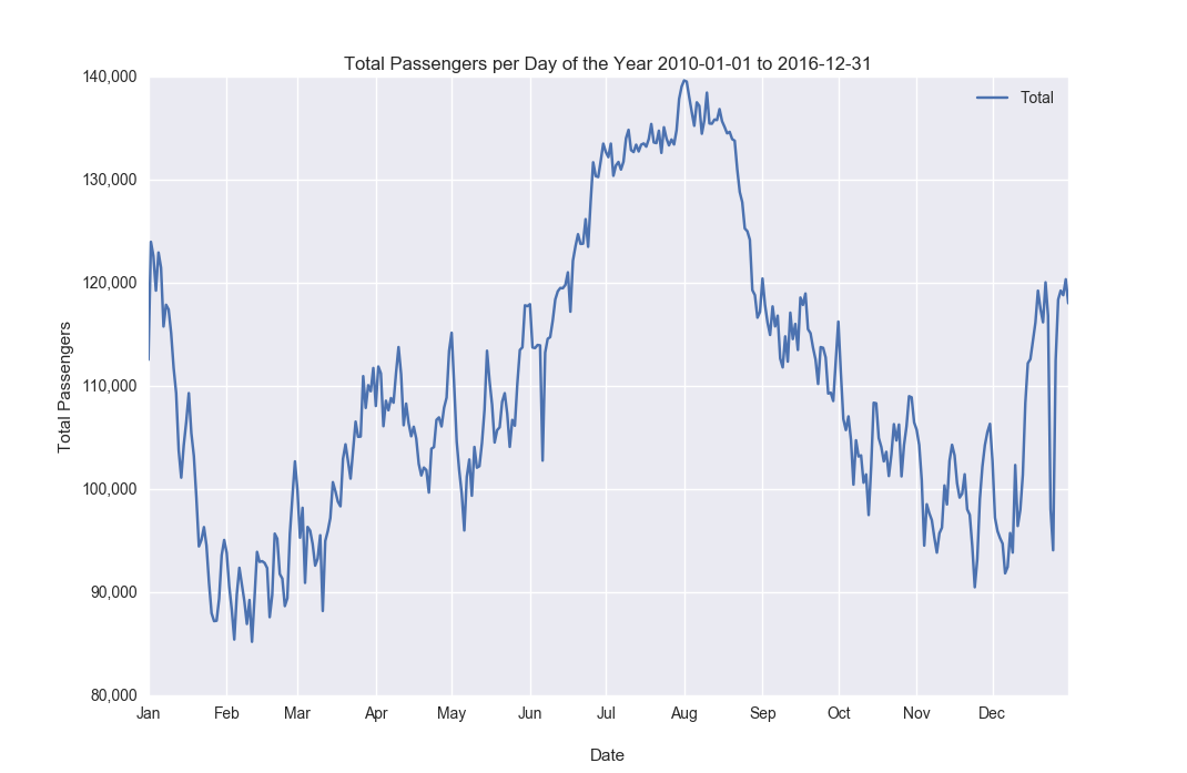
I wanted to take a look at what the most popular times to travel were, so I added up the total number of passengers for each day over the full seven year period that I had data from. One thing to remember here is that we are only looking at LAX and we’re also only looking at the International Terminal. That being said, I was a bit surprised at how much more popular the summers are than the holidays, I would expect people to try to escape their winters and also travel during most common days for time off work. At first glance, it doesn’t seem like a big driver for international travel is visiting family. One of the biggest travel days domestically, Thanksgiving, only gets a small bump internationally. It would be interesting to see the average age of passengers because this makes me think kids/families from are vacationing during summer break.
While the total number of passengers traveling has increased dramatically in the last three years, the average open booths per year haven’t increased that much at all. Maybe they are finding ways to improve efficiency?
Also, Tableau is interactive so click/hover/explore the charts to get more info!
The variance of the average wait time has unquestionably increased over the years. It would be interesting to see if this is due to more variation per hour in passengers. i.e. are they struggling to predict the number of incoming passengers correctly? If this is true, they could be substantially overstaffed during slow periods and understaffed during busy times, keeping the average about the same, but causing significant fluctuations from hour to hour/day to day.
Ideally, if they were able to predict the time each passenger takes to process and the number of incoming passengers perfectly, we would see a tight group right around a mostly flat regression line. What this would mean is they would be hitting their target wait time flawlessly. Not too many officers to be redundant or cost ineffective and not too little to have the wait time be too high. We will always see a slight upward slope in wait time as the numbers of passengers increases because it would be cost ineffective to have 150 officers staffed for a surge that may only last one hour just to keep the wait time linear.
Also interesting to note on the second graph is the number of open booths per passenger has decreased over the years, as can be seen by the slope of the regression on a year by year basis.
We can see a few overall trends, nothing too surprising. More people have traveled, more flights have come in, and # of booths has stayed relatively stagnant. I’m not sure what happened in 2011, but the wait time variance was huge. We saw this in more detail on a few of our graphs above. Rough year for the dudes at the CBP.
Here are the passengers per hour and day of the week. You’re welcome. The hours of operation are 5AM-12AM which is why we see the lull in the morning hours. Flights coming in then would probably be delayed flights and special cases


Here’s a list of the top 10 travel days over the last 7.5 years. This is the sum of all the hours in the day. i.e. the total number of people that traveled that day. We can see they are all recent which calls attention to the growth of international travel through LAX.
| DayofYear | DayofWeek | Average | Max | 0-15 | 16-30 | 31-45 | 46-60 | 61-90 | 91-120 | 121Plus | Excluded | Total | Flights | Booths | PerFlight | MinsWaited |
|---|---|---|---|---|---|---|---|---|---|---|---|---|---|---|---|---|
| 2017-01-07 | Saturday | 29.85 | 90.25 | 594.10 | 387.55 | 174.80 | 90.05 | 169.25 | 78.50 | 9.10 | 47.70 | 1,551.05 | 6.20 | 35.20 | 252.95 | 47,518.25 |
| 2016-08-03 | Wednesday | 24.06 | 70.94 | 626.33 | 391.39 | 213.33 | 136.72 | 112.22 | 2.78 | 0.00 | 52.28 | 1,535.06 | 5.83 | 35.50 | 259.94 | 38,080.72 |
| 2016-08-07 | Sunday | 22.79 | 69.37 | 630.05 | 420.42 | 175.16 | 92.05 | 155.95 | 10.95 | 0.00 | 46.68 | 1,531.26 | 5.89 | 35.95 | 253.99 | 38,809.05 |
| 2016-07-29 | Friday | 27.00 | 81.67 | 600.06 | 371.61 | 173.67 | 137.33 | 163.56 | 35.67 | 2.61 | 46.61 | 1,531.11 | 5.78 | 35.39 | 261.35 | 43,841.56 |
| 2017-01-06 | Friday | 27.95 | 83.00 | 628.26 | 435.63 | 204.74 | 90.68 | 74.68 | 33.21 | 13.53 | 48.21 | 1,529.37 | 6.11 | 34.89 | 277.42 | 38,098.47 |
| 2016-08-21 | Sunday | 21.61 | 64.06 | 691.06 | 378.33 | 170.28 | 96.72 | 106.17 | 40.67 | 0.00 | 45.17 | 1,528.39 | 5.89 | 39.72 | 255.46 | 37,810.61 |
| 2016-08-14 | Sunday | 21.32 | 64.37 | 651.26 | 426.11 | 210.84 | 94.74 | 75.58 | 12.79 | 0.00 | 46.63 | 1,517.95 | 5.84 | 36.32 | 257.29 | 35,065.89 |
| 2016-08-01 | Monday | 19.47 | 60.79 | 647.79 | 461.74 | 232.32 | 91.68 | 35.58 | 1.58 | 0.00 | 46.79 | 1,517.47 | 5.47 | 36.79 | 272.18 | 32,282.95 |
| 2016-07-24 | Sunday | 16.95 | 52.16 | 754.79 | 453.63 | 185.79 | 61.47 | 12.63 | 0.00 | 0.00 | 46.53 | 1,514.84 | 5.79 | 38.42 | 258.05 | 27,090.95 |
| 2016-07-03 | Sunday | 16.37 | 53.47 | 788.63 | 394.47 | 161.32 | 89.16 | 32.58 | 0.05 | 0.00 | 45.53 | 1,511.74 | 5.95 | 38.05 | 247.87 | 28,334.16 |
Efficiency and Statistics
- How long does it take for one officer to process one passenger?
- 2 Minutes and 17 Seconds
- 24 People per Hour
- 162,141 People per year
- How often are people waiting too long?
- Most airlines have a 2-hour minimum international-international connection time. From experience, it takes around 20 mins to taxi and get to border control and 40-45 mins to retrieve bags, re-check bags and get through security to your new gate. Based on this, I’d say waiting for more than an hour would either cause you to miss your flight or cut it extremely close. This happens 3.72 percent of the time.
- What capacity are they running at most of the time?
- 51 Percent or 34 Booths out of 67
- 57 Percent in August (Highest month)
- 47 Percent in November (Lowest month)
- 68 Percent in the top 3 hours of the day
- 80 Percent on the overall top 10 busiest days
- Totals, Maxes, and Averages
- Total Hours in Line
- ~15,136,248 Hours
- Total Passengers Through
- 44,335,799 People
- Total Hours of Officers
- 1,671,515 Hours
- Average Wait Time
- 18 Minutes and 20 Seconds
- Total Passenger Average
- Hourly: 890 People
- Daily: 15,721 People
- Weekly: 109,766 People
- Monthly: 476,457 People
- Yearly: 5,760,472 People
- Total Passenger Max
- Hourly: 6,447 People
- Daily: 31,021 People
- Weekly: 201,133 People
- Monthly: 836,633 People
- Yearly: 7,907,302 People
- Total Hours in Line
How does it work?
-
How do they staff booths?
To me, the most straightforward way to think about the number of booths you need available is to look at how many people are coming in, where they are coming from, and what time of the day/year it is. Even though we can have a variety of nationalities on every plane, if we have a flight arriving from China, where there is less U.S. travel and more cultural and language differences, we might assign more officers that hour. If we use wait time, not only is that a lagging indicator (Wait times have to get large for us to react and, in turn, that means some people have been waiting too long), but it also doesn’t account for the seasonality (time of day/time of year)
Although we can’t infer too much from correlation in this sense because we’re looking at a time series (more people traveling in the summer means everything goes up). I did use the percent change from day to day to reduce this a bit, and it does look like there is some relationship between the total passengers and the # of booths.

-
Does the airport over compensate for high wait times?
We can’t draw any conclusions because of the multitude of things that could explain this including but not limited to seasonality, natural variation, travel pattern, small sample size, etc. At a glance, though, it does look there could be some aspect of mean reversion year over year

-
How much adding another officer decrease the wait time?
- 1 Minute and 6 Second Decrease per Passenger
- 883 Minute Decrease per Hour


Depending on where you are in line this can make a huge difference! If you have 60 people in front of you, that’s over an hour of time not stood in line! Something that would be interesting to explore is how much money the government stands to lose/gain in tax dollars for that extra officer. If a passenger is waiting in line that means that are not part of the economy. They aren’t working, and they aren’t purchasing goods or using services. At what point does reducing the wait time not provide enough tax dollars to justify hiring another officer?
Thinking back to how long is too long to wait, we saw that people are waiting too long around 3.7% of the time. Here we can see when that happens. The blue line is how many booths were open on average, and the green line is the average number of booths we would need open to make sure that no one has to wait longer than an hour.
Other than a few spikes is seems that most of the overages could be eliminated by staffing more people in August, the busiest month.

Here is a look at the average minutes waited per booth per day. Ideally, we wouldn’t see so much variation (seems to be a recurring story) in recent years. It seems they have been trying to operate on the same number of booths without taking into account the increase in traffic. We see most of the high wait times are in recent years where there has been more traffic. Something that would be nice to see here is the more recent years(lighter colors) being shifted over to the right more as they have an increased amount of traffic.
Conclusion
I’m super impressed with how efficient the U.S. Customs and Border Protection Agency is! There is an insane amount of variability with delayed and canceled flights, troublesome passengers, surges, and seasonality, etc. but they seem to handle it well and have a reasonably accurate model of predicting this. Ideally, people wouldn’t ever be waiting too long, but 3.7% is not too bad, and it’s mostly localized to the busy times of the year. It would probably be a good idea to account for this and add a bit of extra connecting time around that time of year. I’m glad we got to take a look at the dataset. Definitely a good intro into exploratory analysis for me. Maybe we can find something with some practical value for our next project. Thanks for reading!